 Free
FreeOpen
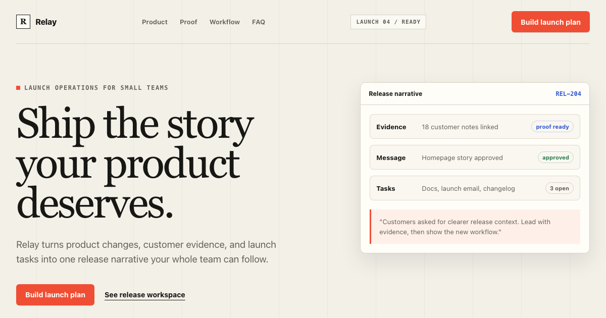
Landing Page DESIGN.md
Template kit by DesignMD
FreeTailwind
Copyable Tailwind DESIGN.md files and Next.js kits with tokens — so utility-class UI stops looking like the default starter when agents generate components.
42 entries
Tailwind DESIGN.md should define spacing rhythm, radius scale, semantic color usage, dark mode behavior and component tone — not just list utility classes.
Agents need explicit rules for card padding, table density, form spacing and when to use border vs shadow. Without that, every screen drifts toward generic gray UI.
Use a Tailwind reference or template scaffold when you only need agent rules. Use a Next.js kit when you want runnable source, tokens export and dashboard routes that already follow the same DESIGN.md.
Templates
6 kits with DESIGN.md and agent context.
FreeTemplate kit by DesignMD
Free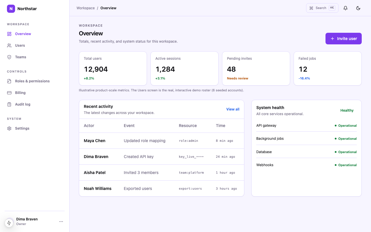 $49
$49Template kit by DesignMD
shadcn DESIGN.md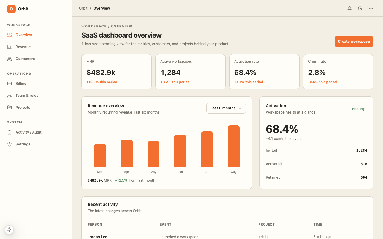 $39
$39Template kit by DesignMD
shadcn DESIGN.md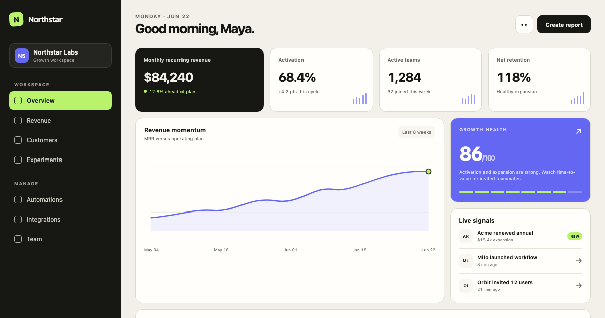 $39
$39Template kit by DesignMD
shadcn DESIGN.md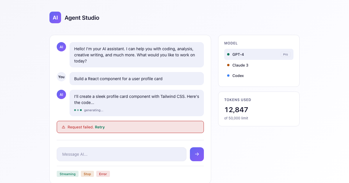 $29
$29Template kit by DesignMD
shadcn DESIGN.md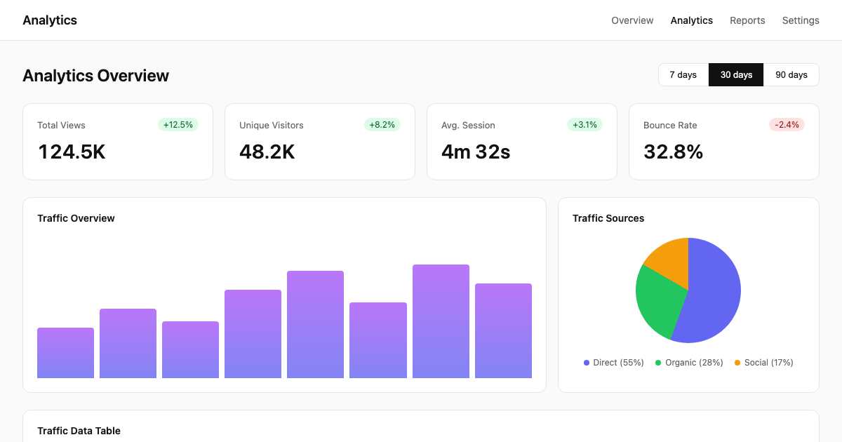 $39
$39Template kit by DesignMD
shadcn DESIGN.mdReferences
Brand and product references that match this tag.
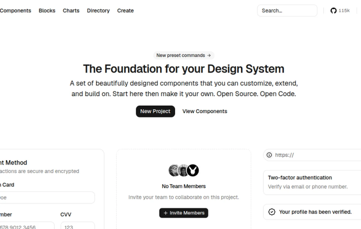 DESIGN.md
ui.shadcn.com · Vercel-style
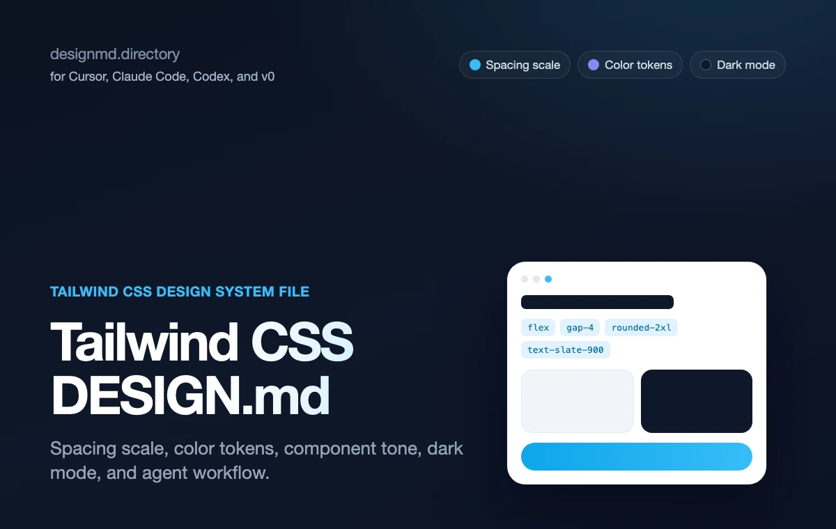 DESIGN.md
tailwindcss.com · Apple-style
 DESIGN.md
cursor.com · Linear-style
 DESIGN.md
tailwindcss.com · Stripe-style
DESIGN.mddesignmd.directory · Practical
 DESIGN.md
tailwindcss.com · Linear-style
DESIGN.mdcursor.com · Linear-style
DESIGN.mdtailwindcss.com · Stripe-style
Resources
Guides, references and related templates.
Tailwind CSS DESIGN.md reference
Full copyable contract for spacing, color, radius and component tone.
Open →Tailwind DESIGN.md template
Starter scaffold for tokens, radius, shadows and utility patterns.
Open →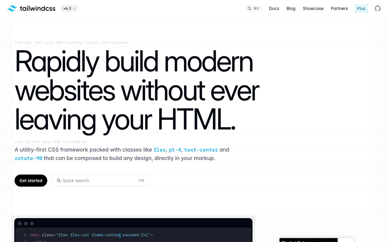
DESIGN.md for Tailwind guide
Educational walkthrough — how and why to write Tailwind-specific design memory.
Open →
shadcn DESIGN.md
Component-system rules that pair with Tailwind utility classes.
Open →