Admin Panel
Admin Panel DESIGN.md for Cursor, Codex, and Claude Code: Light + Dark themes, responsive table rules, semantic states, and Tailwind-ready exports.
Preview
Image$49Open the full preview to inspect theme and responsive behavior.
Purchase to unlock the complete system
The preview stays visible. The runnable source, DESIGN.md context, prompts, tokens, and implementation files become available after purchase.
What's in the $49 bundle
- 7 dashboard pages: Overview · Users · Teams · Roles & permissions · Billing · Audit log · Settings
- DESIGN.md
- Tokens + CSS variables
- Prompts + agent skills
- 18 reusable components
- Personal + commercial license
Stack: Next.js 15 · React 18 · TypeScript · Tailwind CSS · shadcn/ui
Source-backed gallery
Pages included
Every card maps to a route in the runnable source bundle. Open the matching preview path to inspect its route context, then use the ZIP for the runnable source.
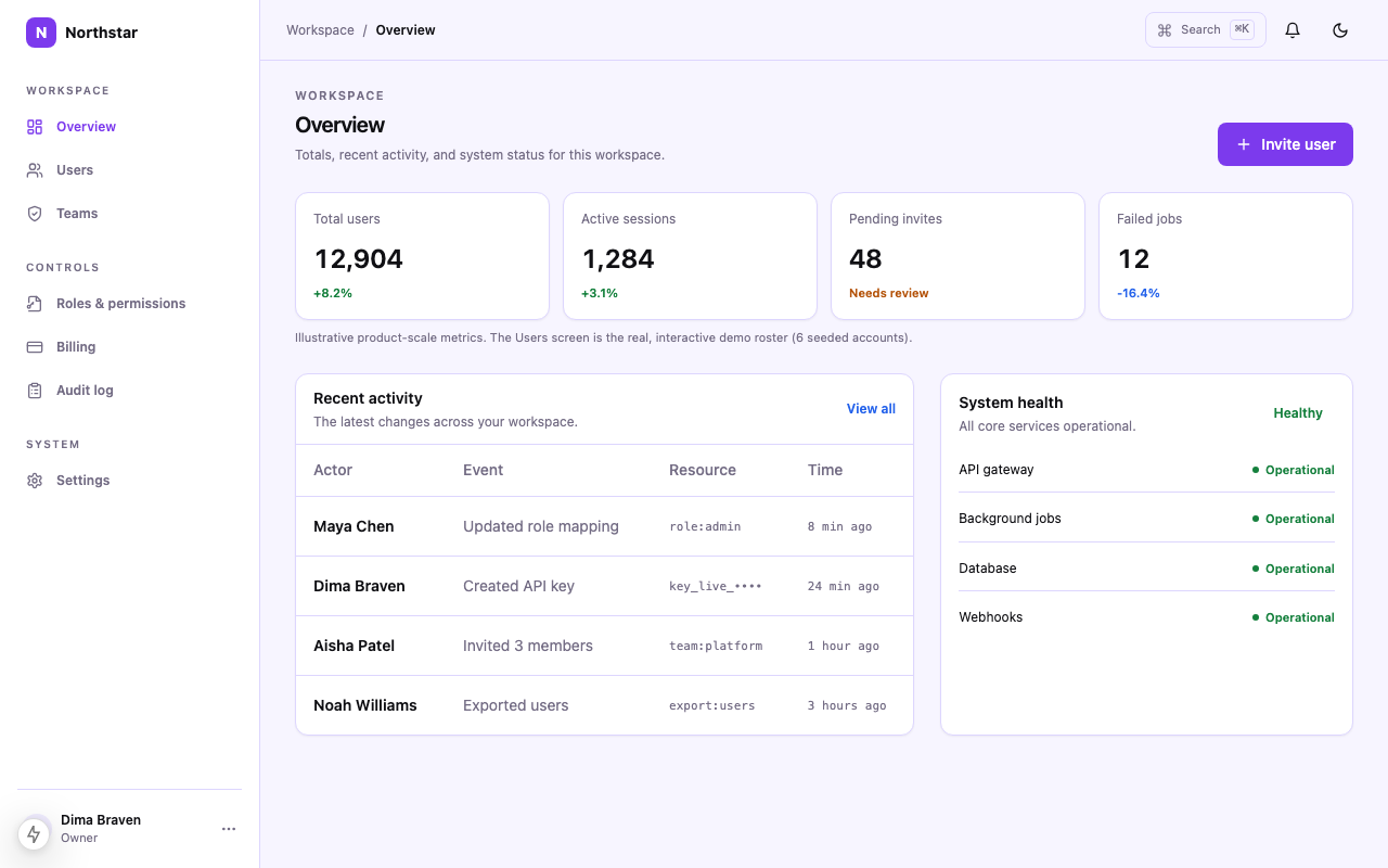
Overview
Scan system health and recent operational changes.
source-template/components/screens/overview.tsx
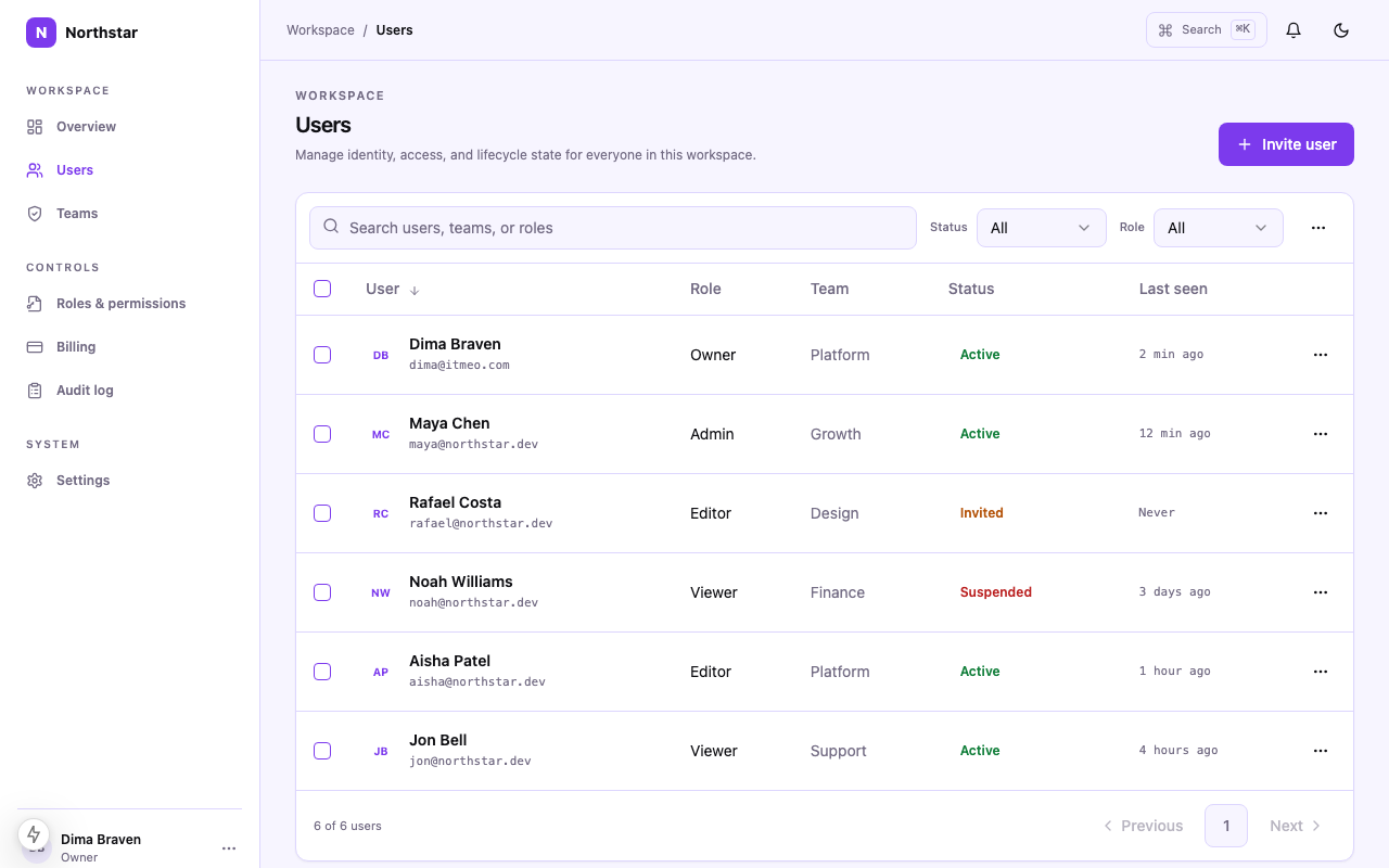
Users
Search, select and bulk-manage users.
source-template/components/screens/users.tsx
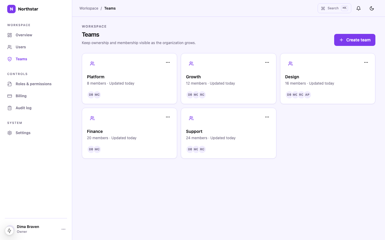
Teams
Review teams and their membership state.
source-template/components/screens/teams.tsx
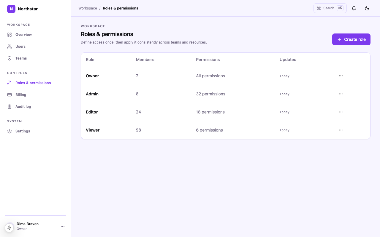
Roles & permissions
Inspect role definitions and permission-denied states.
source-template/components/screens/roles.tsx
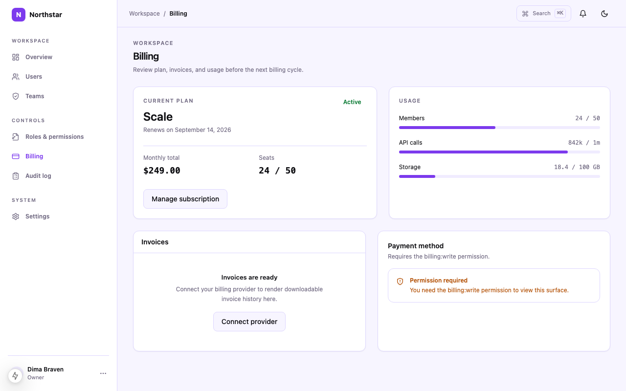
Billing
Review internal billing records and access boundaries.
source-template/components/screens/billing.tsx
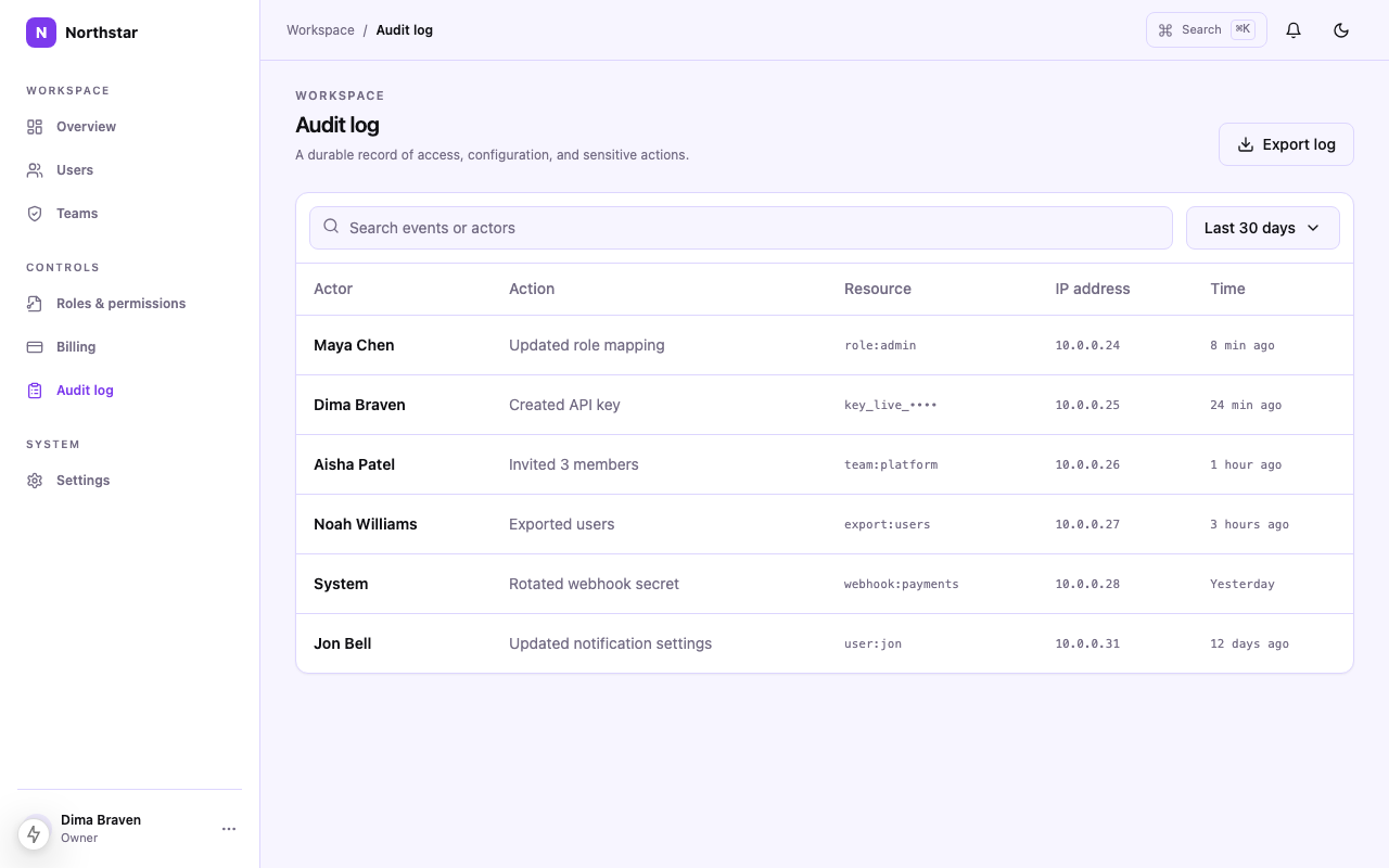
Audit log
Filter and inspect administrative changes.
source-template/components/screens/audit-log.tsx
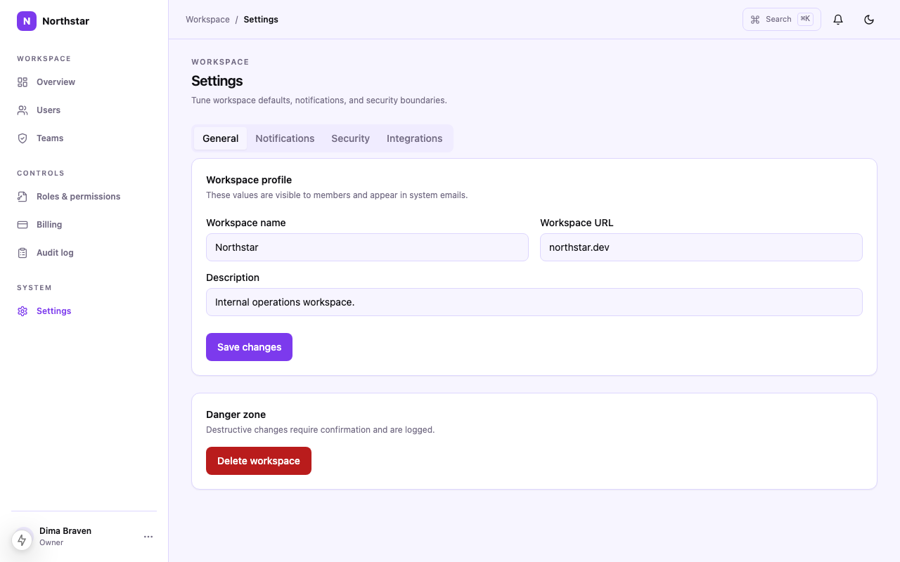
Settings
Configure system settings with destructive confirmation.
source-template/components/screens/settings.tsx
Public design system
Dense tooling with Light + Dark theme contracts
Built for internal operators, not customers: a persistent 240px sidebar, 36px dense table rows, and a bulk-action bar that appears the moment rows are selected. Sidebar density, data-table completeness, stat hierarchy, filter and bulk-action patterns, semantic states, and keyboard focus are all specified, not left for an agent to guess.
Token roles
- Primary Violet — Primary actions and active navigation
- Dark Ink — Dark admin canvas and high-contrast text
- Soft Surface — Light admin canvas and palette surface
- Action Blue — Secondary actions, links and data emphasis
- Highlight — Raised panels, table surfaces and contrast
- Dark Primary — Primary actions on dark surfaces
Typography and rhythm
- Display: Inter, -apple-system, BlinkMacSystemFont, sans-serif
- Body: Inter, -apple-system, BlinkMacSystemFont, sans-serif
- Spacing base: 4px
- Scale: 4 · 8 · 12 · 16 · 20 · 24 · 32 · 40px
- Responsive rules: Desktop (>1024px): persistent 240px sidebar, dense multi-column grids Tablet (768–1024px): sidebar collapses to icons; tables scroll horizontally
What is included in the download
The paid ZIP contains the runnable source, design contract and agent handoff artifacts. The public file tree is intentionally visible before purchase.
Run locally
cd source-template && pnpm install && pnpm devNot included: authentication, database persistence, Stripe, email, analytics providers, authorization enforcement and production API credentials.
AI-agent workflow
How to use
$read DESIGN.md --agent codexRead DESIGN.md with Codex before editing UI. Preserve local imports, responsive behavior, accessibility, and the existing shadcn/ui component context.
Install
Run pnpm install and start the local source template.
Load context
Keep DESIGN.md, components.json, and tokens in the project root.
Extend
Use the prompts and shadcn/ui component context before adding new patterns.
Related templates
Tokens
Template palette
Named roles from the template contract. Every swatch is keyboard-copyable and includes its intended use, so the palette stays meaningful outside this preview.
Token details
Brand
Surfaces
Text
Status colors
| Status | Light | Dark | Usage |
|---|---|---|---|
| Success | Healthy, active, completed on light surfaces | ||
| Warning | Degraded, pending review on light surfaces | ||
| Danger | Errors, destructive, offline on light surfaces | ||
| Info | Informational, links on light surfaces |
More templates
Related templates
Explore other ready-to-use DESIGN.md templates for your next project.
 $39
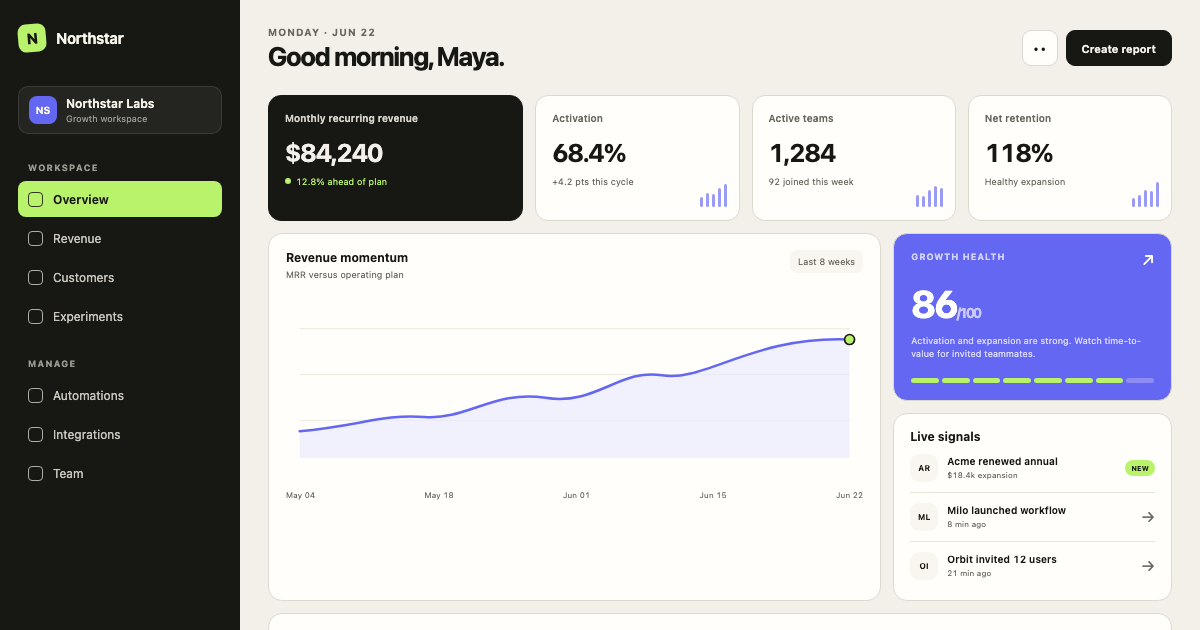
$39Minimal SaaS Dashboard
A calm, data-dense SaaS operating system with warm neutral surfaces, graphite navigation, electric signal accents, and a strict 4px grid.
 $39
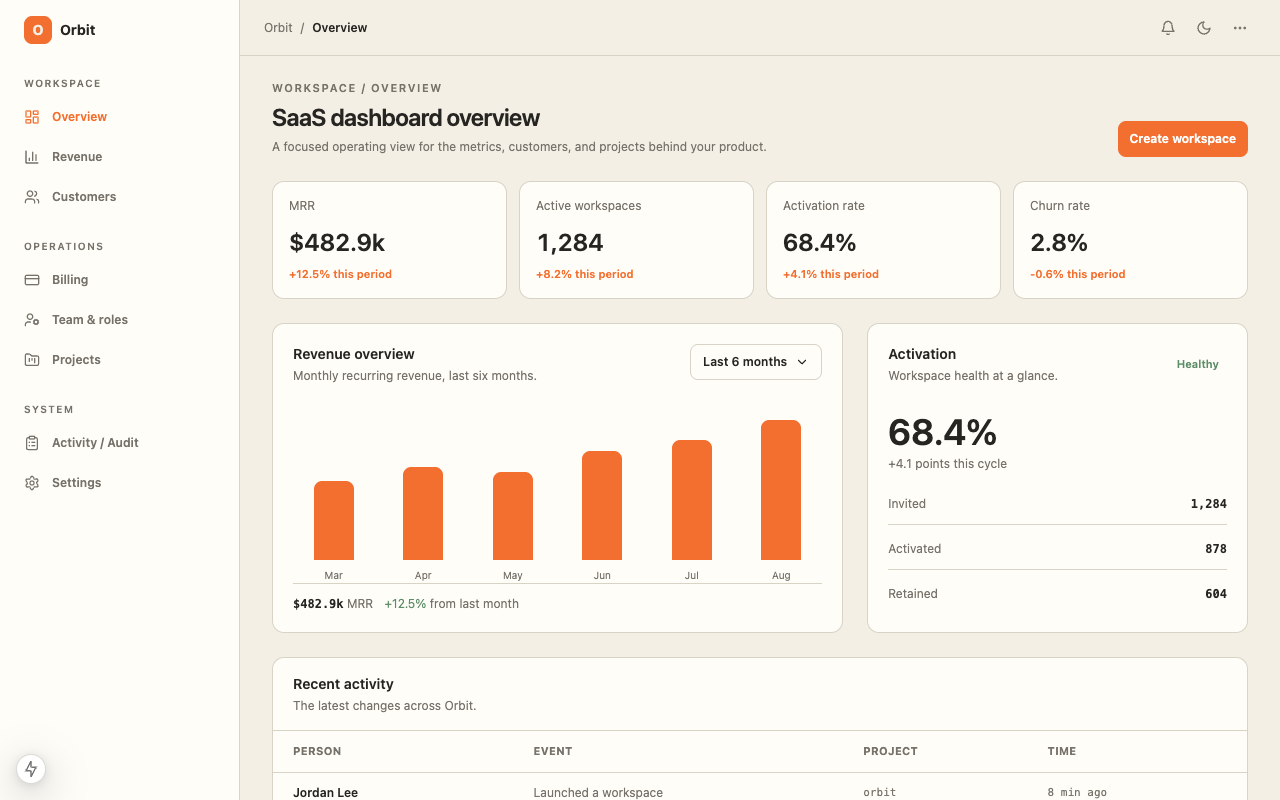
$39SaaS Dashboard
A ready-to-code SaaS dashboard starter with responsive metrics, customer operations, revenue views, and a warm operational data interface with orange and green signal colors.
 Free
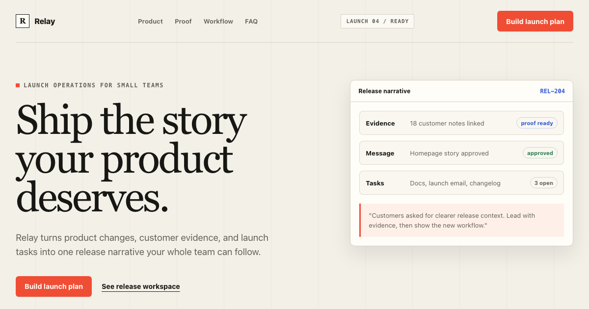
FreeEditorial Product Landing Page
A complete conversion system for product launches: warm editorial composition, signal-red action hierarchy, product evidence, section rhythm, copy limits, and mobile rules.
 $29
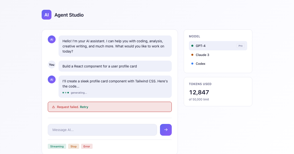
$29AI App Starter
A dark-first DESIGN.md for AI apps: deep space canvas, an indigo-to-violet brand gradient reserved for generative moments, calm neutrals, and streaming-aware states.
Need to know
Frequently asked questions
Practical answers about this template, its implementation scope, and the source bundle.