Developer Docs
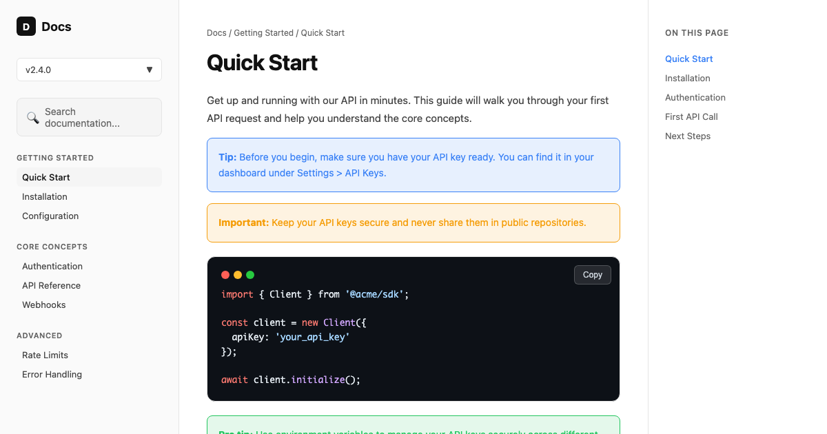
A readable developer-docs DESIGN.md: high-contrast light body at a 72ch measure, a first-class dark code theme with syntax colors, a three-column layout, and a blue link accent.
- Tokens
- 16
- Components
- 8
- Themes
- Light + Dark
- Responsive
- 3 breakpoints
Preview Lab
LiveInspect theme and responsive behavior
Design system overview
Docs developers actually want to read
A readable developer-docs system: high-contrast light body at a 72ch measure, a first-class dark code theme with syntax colors, a three-column layout, and a blue link accent.
The template defines the working system behind the preview: three-column layout, navigation density, first-class code blocks, callouts, on-page TOC, search, responsive collapse, keyboard focus, and implementation rules for AI coding agents.
Primary
One clear action
Active navigation and primary controls
Typography
$482,900
Total revenue
+8.2% this month
Controls
Status
Tokens
Color system
Named roles from the template contract. Every swatch is keyboard-copyable and includes its intended use, so the palette stays meaningful outside this preview.
Brand
Surfaces
Text
Semantic
Data visualization
Source file
Raw DESIGN.md and export formats
This is the single canonical source view. Anonymous visitors see a short preview; signed-in users get the complete Markdown and generated implementation formats.
# Developer Docs DESIGN.md
## Product feel
Build clean, readable technical documentation that developers trust and scan quickly. Use a light,
high-contrast body with a comfortable measure, a first-class dark code theme, and a blue accent for
links and active navigation. Content and code are the product; the chrome stays out of the way.
## Color system
### Brand
- Ink: #111111 — headings, body, primary actions
- Blue: #3b82f6 — links, active nav, focus accent
### Surfaces (light body)
- Canvas: #ffffff — page background
- Subtle: #fafafa — sidebar, code inline, quiet bands
- Border: #e5e5e5 — separators, card and code-block outlines
### Text
- Text Primary: #111111 — headings and body
- Text Secondary: #666666 — descriptions, metadata
- Text Tertiary: #444444 — secondary nav, captions
### Code theme (dark blocks)
- Code Background: #0d1117
- Code Text: #e6edf3
- Keyword: #ff7b72
- Function / Type: #d2a8ff
- String / Value: #a5d6ff
- Terminal dots: #ff5f56, #ffbd2e, #27ca40
### Semantic (callouts)
- Note / Info: #3b82f6
- Tip / Success: #22c55e
- Warning: #f59e0b
- Danger: #ef4444
## Dark mode
- Canvas: #0d1117, Subtle: #161b22, Border: #30363d
- Text Primary: #e6edf3, Text Secondary: #8b949e
How to use this template
- 01
Copy
Copy the complete DESIGN.md content from this page.
- 02
Paste
Create a DESIGN.md file in your project root and paste it in.
- 03
Reference
In your AI agent chat: "Build the next screen following DESIGN.md."
- 04
Generate
The agent applies the tokens, spacing, and component rules automatically.
Use with AI Coding Agents
Copy one of these prompts into your AI coding agent to apply the Developer Docs DESIGN.md design system to your project. The DESIGN.md file in your repo root is the source of truth.
# .cursor/rules (or DESIGN.md) You are working in a project that uses the Developer Docs DESIGN.md design system. Read the DESIGN.md file in this project root and follow it strictly when generating UI. Match the brand's exact colors, typography, spacing scale, and border radius. Do not create generic Tailwind UI — apply the visual language from DESIGN.md. Key rules: - Use the defined color palette, not arbitrary hex values - Apply the correct font family and weight scale - Follow spacing tokens (4/8/12/16/24/32px scale) - Match component patterns: buttons, cards, inputs, badges as specified
More templates
Related templates
Explore other ready-to-use DESIGN.md templates for your next project.
Minimal SaaS Dashboard
A calm, data-dense SaaS operating system with warm neutral surfaces, graphite navigation, electric signal accents, and a strict 4px grid.
Editorial Product Landing Page
A complete conversion system for product launches: warm editorial composition, signal-red action hierarchy, product evidence, section rhythm, copy limits, and mobile rules.
AI App Starter
A dark-first DESIGN.md for AI apps: deep space canvas, an indigo-to-violet brand gradient reserved for generative moments, calm neutrals, and streaming-aware states.
Ecommerce
A minimal, editorial ecommerce DESIGN.md: bright neutral canvas, near-black ink, generous whitespace, and a strict product grid where imagery is the hero.
Goes well with
Frequently asked questions
How do I use the Developer Docs DESIGN.md template with Cursor?
Copy the full DESIGN.md from this page into your project root, or add it to .cursor/rules when you want Cursor-specific project rules. Then prompt: "Read DESIGN.md and follow its design system for every UI change."
Is the Developer Docs template free for commercial projects?
Yes. All DesignMD templates are MIT licensed — copy, modify, and ship them in commercial products without attribution.
What does the Developer Docs DESIGN.md include?
Developer Docs documents light + dark tokens, responsive layout rules, and Navigation Sidebar, Code Block, Callout, On-page TOC patterns for AI coding agents. It is prepared for Cursor, Claude Code, Codex.